Sales forecasting using Python
Demo Video

Client Tool
This demo will use Sagemaker jupyter notebook.
The screenshots for this demo will leverage the BI Tool of QuickSight. Be sure to complete the BI Tool setup before proceeding.
Please go through Demo preparation first.
Then open notebook sales_forecasting.ipynb
Challenge
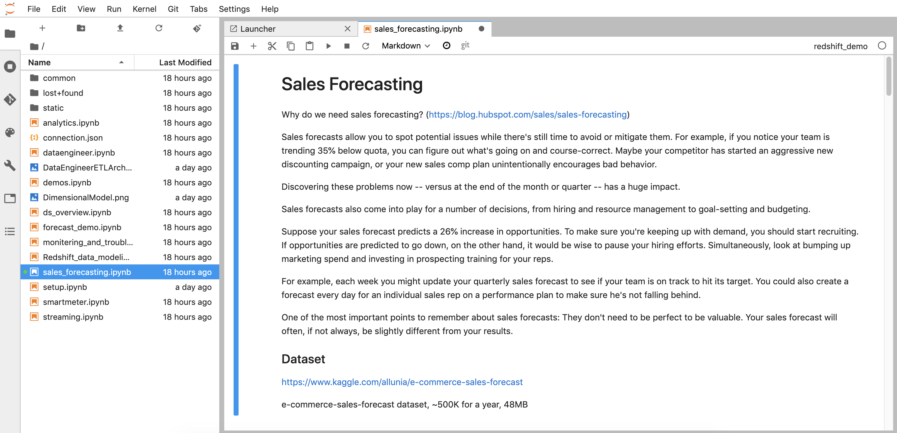
Kim (Data scientist) has been tasked to track if sales team is on track to hit quarterly sales target, and determine if we have enough workforce to keep up with demand. To achieve this, Kim plans to build an machine learning model to forecast sales for next 30 days which will help driving decisions, such as hiring, resource management, planning and budgeting. To accomplish this Kim will have to do the following steps.
- Demo Video
- Client Tool
- Challenge
- Python - ML WorkFlow
- Data Preparation
- Model Training and Evaluation
- Forecasting
- Creating Dashboards
- Before you Leave
Python - ML WorkFlow
Data Preparation
| Say | Do | Show |
|---|---|---|
|
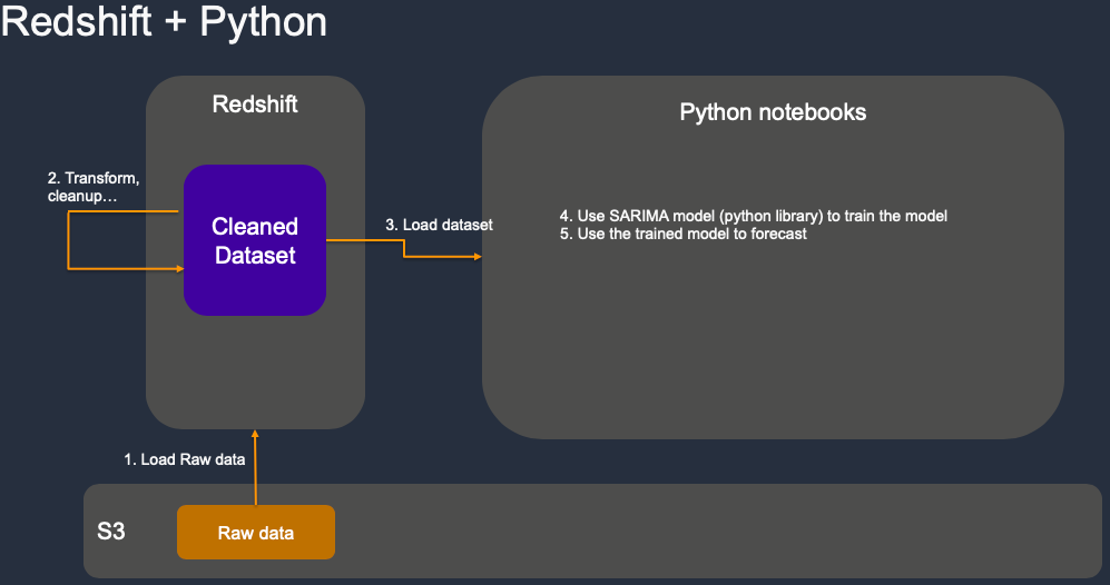
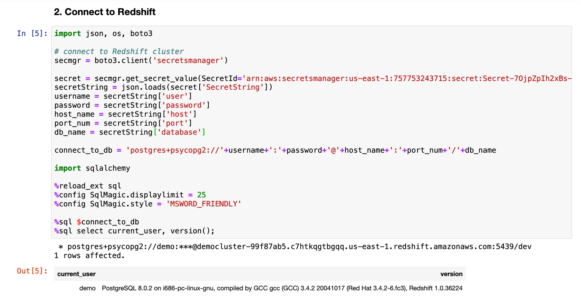
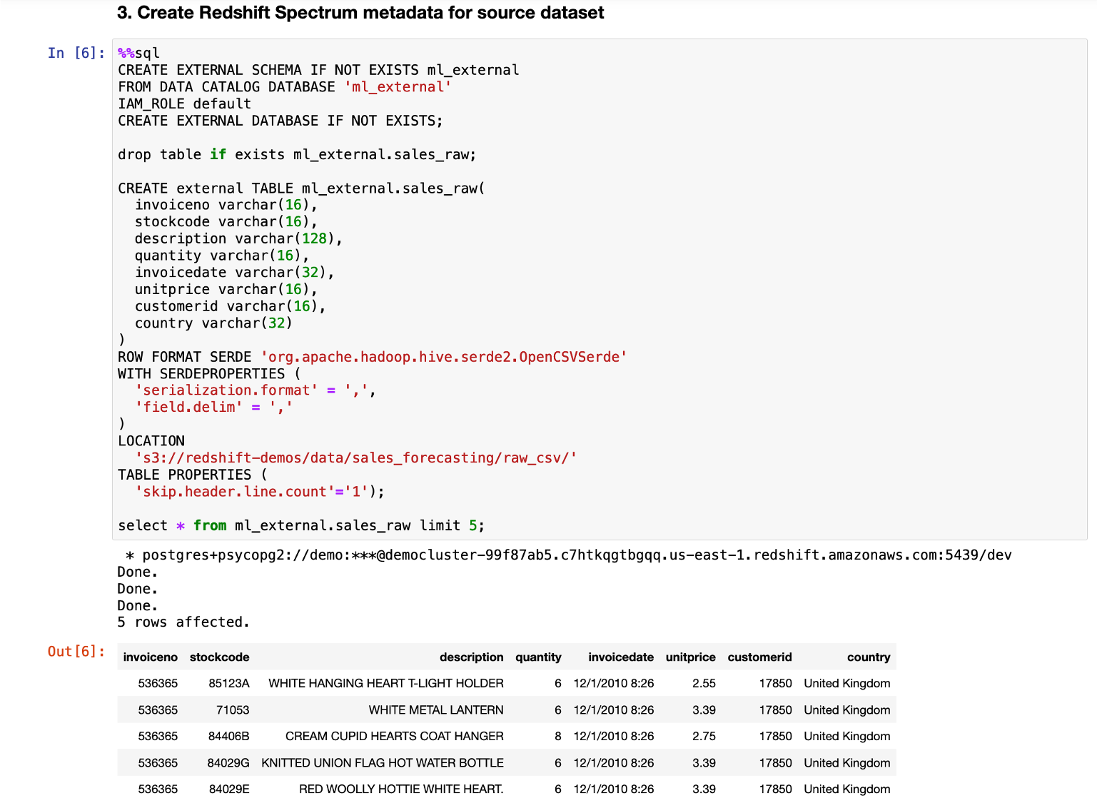
We have history sales transaction data of last year stored on s3. First Kim created an external table point to it so she can exam the dataset quickly without loading it into Data warehouse. |
Go to sales_forecasting notebook and execute step 2 and 3. |
|
| Kim found out the data is not clean. For example, in some transactions, CustomerID is null, sale item quantity is null, some records are for damaged goods, wrong order, or samples… Those should be excluded from the forecasting. So she decided to load the data into Redshift data warehouse and leverage its power to cleanup and transform the data efficiently. | Go to sales_forecasting notebook and execute step 4. |

|
Model Training and Evaluation
| Say | Do | Show |
|---|---|---|
|
Kim uses Redshift to aggregate the whole year sales transaction data to daily sales time series data and load them into notebook, then split the data into train and test sets for model training and evaluating.
For standard machine learning tasks such as classification and regression, one typically obtains this split by randomly separating examples into train and test sets. However, in forecasting it is important to do this train/test split based on time rather than by time series. |
Goto sales_forecasting notebook and execute step 5 |

|
|
After tried various model including Auto regressive model (AR), Moving averages model (MV), AutoRegressive Integrated Moving Average (ARIMA), Kim determined SARIMA is the best one, which has a seasonal correlation and can identify the seasonality of the time series and provide more accurate prediction.
To get the right parameter easier and faster, Kim uses auto_arima to tuning the model automatically |
Goto sales_forecasting notebook and execute step 6
Depend on your notebook instance type, this step could take 2-5 minutes. In the output of step 6, scroll down to find and show model summary. |

|
Forecasting
| Say | Do | Show |
|---|---|---|
| Now Kim can do forecasting for next 30 days using the trained SARIMA model. We use python matplotlib for visualization. It’s integrated with Pandas DataFrame so we can easily plot the forecasting result in notebook.. |
Go to sales_forecasting notebook and execute step 7. |

|
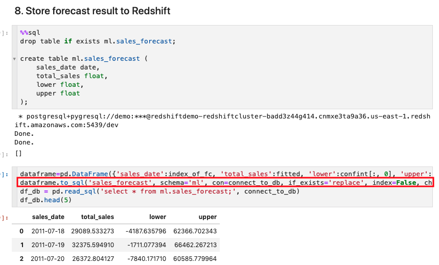
To analyze the forecast result further and build dashboard on it, Kim stores the result back into Data warehouse in table ml.sales_forecast. This can be done by using Pandas DataFrame directly if the resultset is small. DataFrame can insert the result to target database in batch.
|
Go to sales_forecasting notebook and execute step 8. |
|
|
Kim also uses SARIMA model to analyze popular product trend and forecast sales for them.
Note: It’s safe to ignore the warning here. |
Go to sales_forecasting notebook and execute step 9, then select a product and click the Run Interact button.
|

|
Creating Dashboards
| Say | Do | Show |
|---|---|---|
|
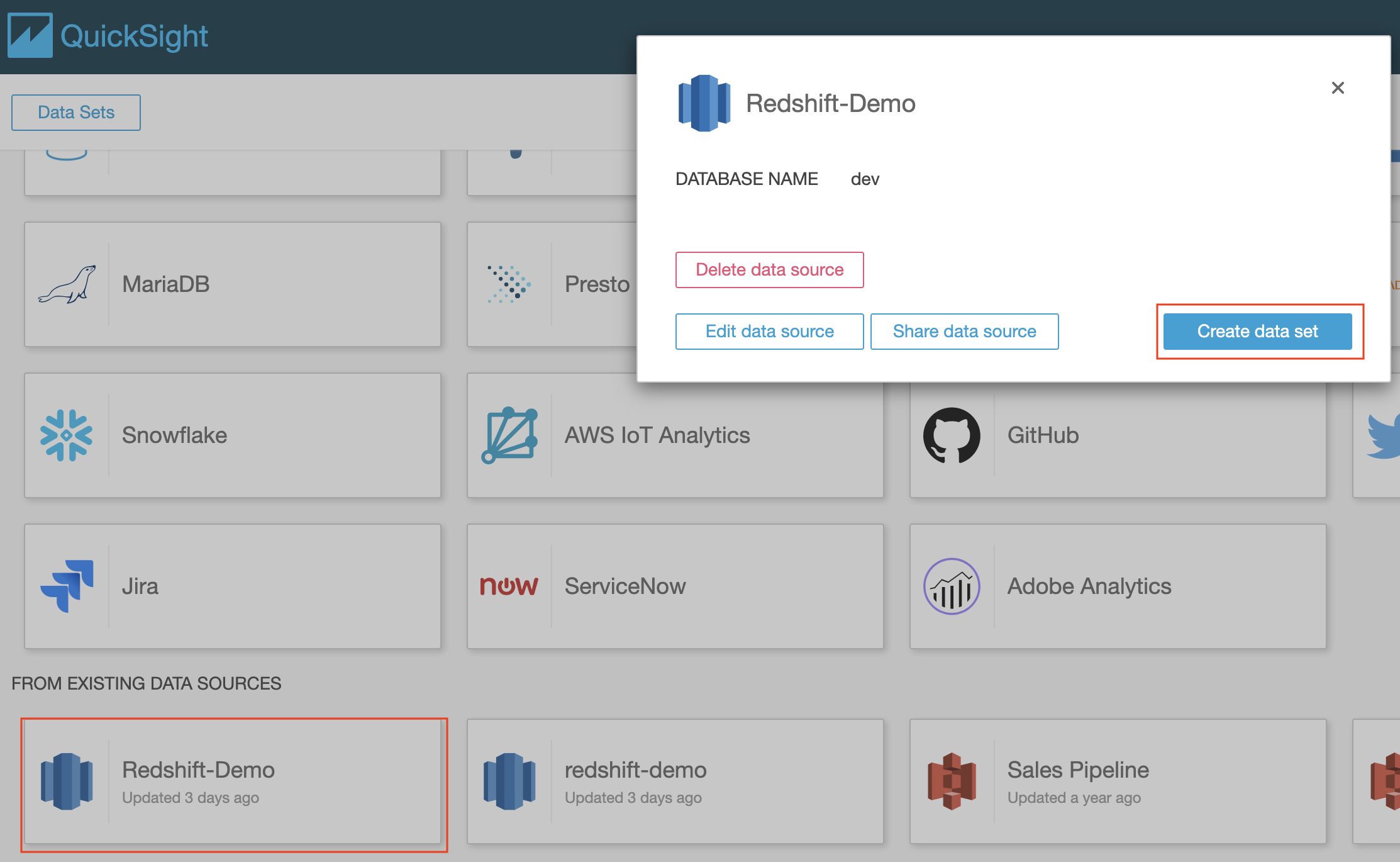
Now Kim can visualize forecast result for next 30 days using Quicksight Dashboards and share results with her team.
The first step in building a Quicksight Dashboard is to setup the dataset. |
Navigate to Quicksight and Create a new Data Set using the source created earlier. |
|
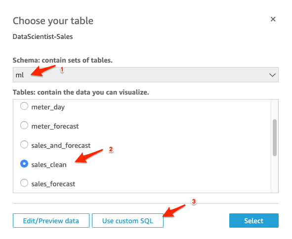
| The actual sales data is stored in “sales_clean” table in “ml” schema. We will visualize it first to compare with forecast data. | Select the “ml” schema from the dropdown list and select table “sales_clean” under the Tables section. Click on “Use custom SQL” button |
|
| We will use “Custom SQL” to select the data required and add weekly, monthly buckets |
Name the Query as “DS Sales History SQL”, enter the SQL code below into “Custom SQL” section, and click “Confirm query”.
On the next screen click on Visualize button
|

|
| We will use line chart to show the history sales over time. |
For the “Sales by day” choose the following parameters:
|

|
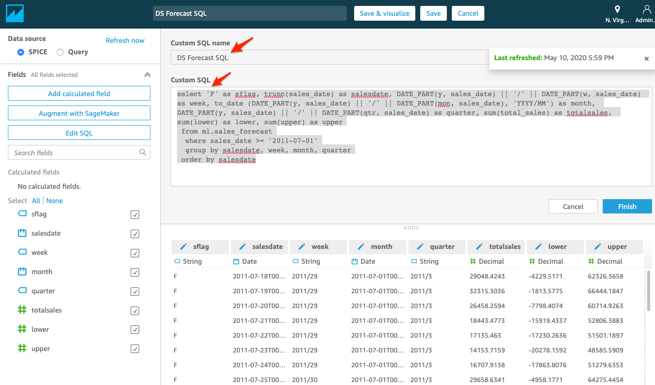
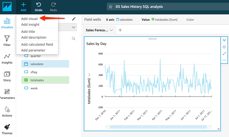
| We will now add a second data set and visual for the “Forecast for next 30 days” and create an new visualization |
Enter the SQL code below into “Custom SQL” section, and click of Finish, and then click on “Save” and name the dataset “DS Forecast SQL”
|
|
| Let’s format the visual to make the y-axis align. |
|

|
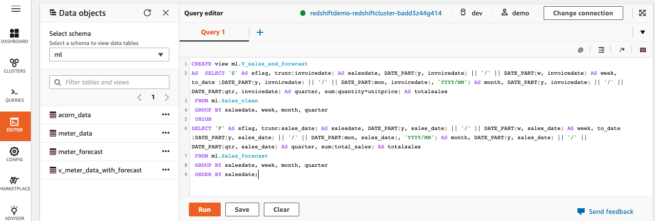
| If Kims wants to show Sales and Forecast in one view, then she needs to combine the Sales and Forecast data. For this we can create a view from Redshift data warehouse. |
In Redshift Query Editor, create a view using below SQL
|
|
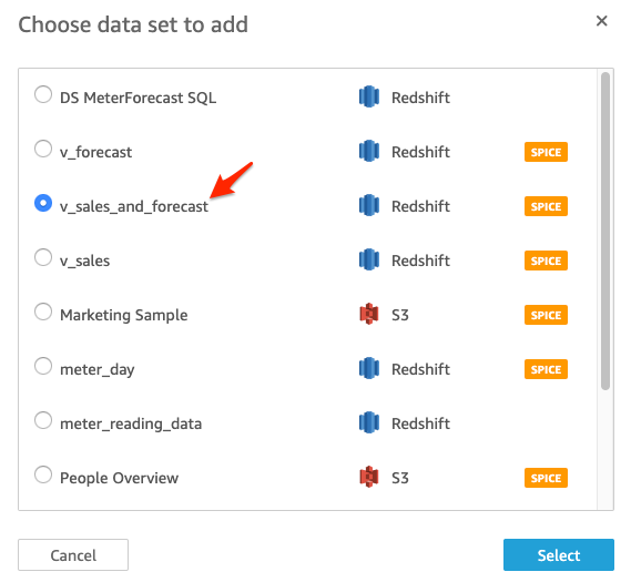
| We will now add the third data set “v_sales_and_forecast” and create visualization for the “Sales and Forecast by Month” |
Click on “Add” and then click on “Add data set” From the list choose “v_sales_and_forecast” and click Select |
|
| We will now add a third visual for the “Sales and Forecast by Month” and create an new visualization |
Select the dataset “v_sales_and_forecast”, and click on “+Add” button as shown and add Visual for the second dataset.
For the third visualisation set name to “Sales and Forecast by Month” choose the following parameters:
Dataset: v_sales_and_forecast; x-axis = month, value = totalsales
For Visual Type: choose Bar Chart
|

|
Before you Leave
To clear out any QuickSight changes you made during the demo, delete the Dashboard, Analysis & Data Set you created.
Please execute the Cleanup step to clear out any changes you made during the demo.

If you are done using your cluster, please think about deleting the CFN stack or to avoid having to pay for unused resources do these tasks:
- pause your Redshift Cluster
- stop the Oracle database
- stop the DMS task